Humanæ project, a look at flesh tones
A few weeks ago I made shout-out to the Humanæ Project (http://humanae.tumblr.com) on our podcast. In the artist Angelica Dass’ own words: “The project development is based on a series of portraits whose background is dyed with the exact Pantone® tone extracted from a sample of 11x11 pixels of the portrayed’s face. The project’s objective is to record and catalog all possible human skin tones.”
Since commenting on it, the project has made rounds in the color correction community. Like me, the idea of a catalog of human flesh tones resonated with a number of people. I’ve decided to go one step further and use Dass’ images as a basis for exploration in ScopeBox.
The methodology…
I grabbed all 150 images from the projects tumblr site using Google Chrome. The images were batch processed using Photoshop CS6 actions to remove the white label at the bottom, and resize them to fit in a single 1920x1080 HD frame. Next a separate action was used to make a second set of images composed of just the pantone color sampled form the background plate (top left corner). Photoshop contact sheets were made form the two resulting folders of images.
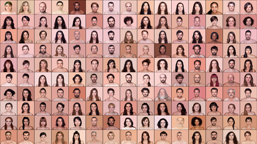
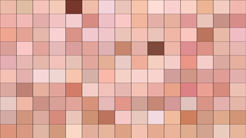
Both images were saved and brought into Final Cut Pro X. FCPX was chosen because of Apple’s attention to colorspaces with the newest version. I felt confident that the sRGB psd files would be accurately converted to video colorspaces on export. The sequence was saved out as 10bit YUV uncompressed, and opened in ScopeBox.
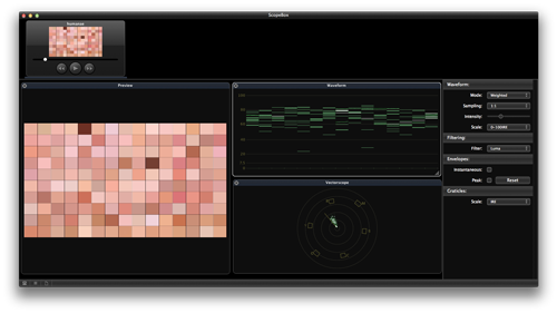
In addition to screen grabs, individual palettes were exported as high quality PDFs using the new “Save as Image” feature of ScopeBox 3. These were brought into Adobe Illustrator and prepped for the web.
On to the findings…
All right, enough boilerplate. First lets look at the grouping of luminance in the Waveform.
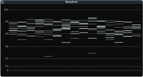
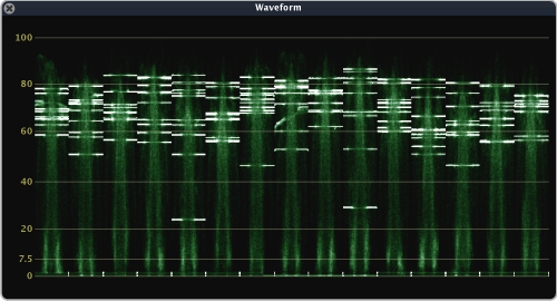
Common practice for shooters is to try to place flesh tones at 70IRE (hence 70% zebras on many cameras), and that practice seems to match what we see here. Despite the fairly wide range of luminance, the color chips are nicely bracketed around 70IRE. In the full image version, we can see the strong upside down U shaped trace in each column showing the dark hair starting at black, with the top of the shape being forehead and cheek highlights (nicely falling at 90IRE). So far so good - it looks like were seeing in the scopes what we’d expect.
The Vectorscope matches common wisdom less:
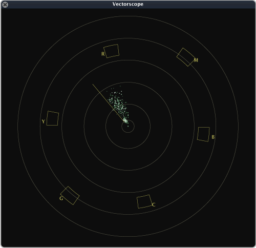
The ScopeBox Vectorscope, like that in FCP and some other software scopes, has foregone the earlier I/Q axis graticles for a small “flesh line” which is merely a short subset of the I axis found on NTSC scopes. While I can’t speak to the thinking of the other app’s developers, we did this because while the I/Q axises are anachronistic, the flesh-line proves useful to correct flesh hues. It’s strange then that the vectorscope show the majority of the skin tones in this test fall far red of the flesh-line. I was actually surprised how red these color chips skewed, and thought maybe this was due to the sampling of a single color per face (many of the faces were sunburned, far redder than their torsos). I thought, perhaps the full image version will center better on the flesh-line?
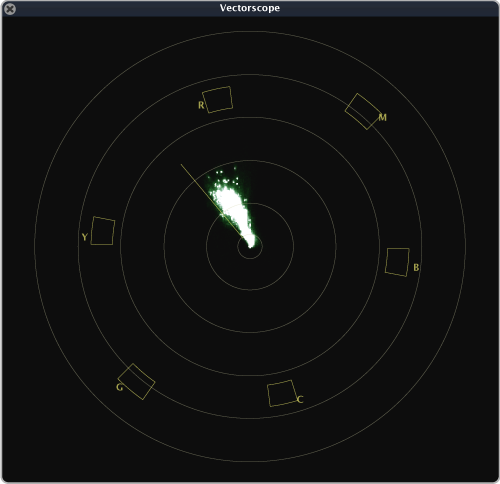
The full image vectorscope filled in the gaps between the color chips, but didn’t noticeably skew the results yellow/green. Perhaps there’s some methodological problem with the model choice, or capture method, but I’m surprised by the results. Perhaps the flesh-line needs to be re-evaluated now that it’s purpose is orphaned from the original I-axis.
Edit (7-31-2012): This conversation of the fleshline needs a bit of nuance. The fleshline in ScopeBox is not exactly analagous to the I-Axis in other tools. I’ll be posting a blog at how ScopeBox chose to implement this tool, the advantages, the disadavantages, and what it means to users.
In the coming months I plan to continue to follow the Humanæ Project, and retest as they add images. Perhaps the community as a whole should consider a test/database of our own.
What do you think? You can reach us at support@divergentmedia.com.